CAS Thinking of You
May 17th, 2011
Happy Tuesday! While working on what I wanted to do with the Faux Framing Technique for my class last week, I created this Clean and Simple card that also features TE Discover Your Wings, as did the card we made in class. You can see that card in this post – fun to see how the same set and the same technique can be used to create cards with very different feelings to them.
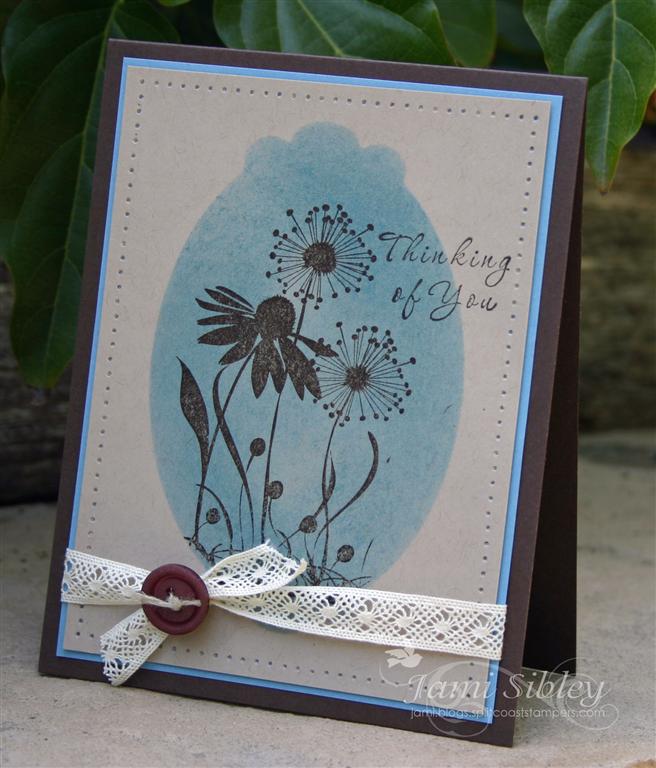
This card is made with Early Espresso, Marina Mist, Crumb Cake (Kraft for pete’s sake!) cardstock, plus Espresso and Marina inks. The faux frame was created with Spellbinders Labels 10 cut into a pice of copy paper to create the reverse mask. Lace trim is from SU and the button is from my stash.
Thanks for stopping by!
![]()
Black Magic Garden Party
May 24th, 2010
Happy Monday! I have one more card to share from my class a little over a week ago. Somehow I never got over here to show it to you last week. As soon as I saw this the Black Magic technique on JanTink’s blog and then Wendybell’s video I knew it would be a super fun thing to do in class. And I also knew that TE’s Garden Party Blooms would be a great set to play with.
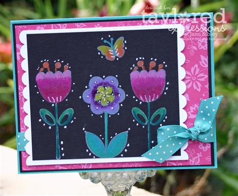
This was so much fun and so easy too! Stamp bold images on dark cardstock (I used black) with white craft ink and allow to dry (or heat set if you’re in a hurry). Then color over the images with Prismacolor Pencils using a fairly heavy hand. The instructions I read/saw said to use watercolor pencils so I tried that first, but then decided to also try the Prismacolors. While both worked, I found that I got a better result with the Prismacolors and I have a larger color range in those as well. You’ll want 2 or 3 shades of the same color and work from dark to light. Highlights are added with a white gel pen. Paper used here is all SU: black, Bermuda Bay , white and Melon Mambo dp. If you haven’t tried this technique, you really need to! Tons of possibilites!
Last night was the series finale of LOST and I just have to share my take on it. If you have it saved to dvr to watch later then you probably won’t want to read this. While I thought the final 2 1/2 hour episode was beautifully done in it’s own right, as the end to six years of mystery and questions I felt it was far less than satisfying. In my mind it confirmed what I had been afraid of all along…that the writer’s really didn’t have answers to all the mysteries they proposed. Perhaps they felt that a long, emotional, somewhat poetic final episode would make up for all that, but it didn’t. At least not for me. 
Thanks for stopping by. I hope you’re surviving Monday and have a great week ahead!

My April SU Class
April 4th, 2009
Class last night was so much fun! I feel so fortunate to be a Stampin’ Up! Demonstrator and have such a wonderful group of ladies for customers! We made 3 projects last night. I already shared the cards we made with Oval All (see below).
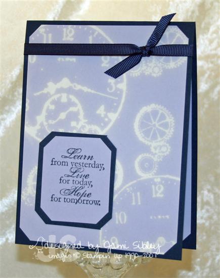
Here’s a card using the new stamp set Sense of Time with the Bleach Technique. I love the white ghost look of bleach on Almost Amethyst cardstock. The base of this card and the grosgrain ribbon are both Night of Navy. To stamp with bleach simply take a folded up damp paper towel and pour some Clorox bleach on it (I’ve been told that bargain bleach does not work as well) and use that as your stamp pad. It takes a few seconds for the bleach to take effect on the cardstock once you stamp your image. Watching it is like magic. It’s fun to see the result on different colors of cardstock as the bleach has different results on each color.
Our third class project was this fun basket and Easter bunny.
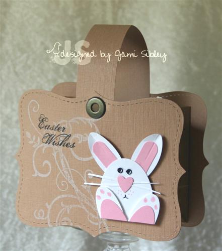
The basket was created with Textured cardstock run through the CB or Big Shot with the Top Note die and attached to a small kraft bag that I cut down to 3″. This was inspired by a bunch of these I saw in the SCS gallery.
The front was stamped with white craft ink with the large flourish image from Baroque Motifs and the Easter sentiment from All Holidays was added. I saw the punched bunny in the SCS gallery of girl3boys0 and immediately had to figure out how to make it!
Once I had it figured out, I made this punch guide for my customers. Click on it to enlarge. I hope it makes sense to you.
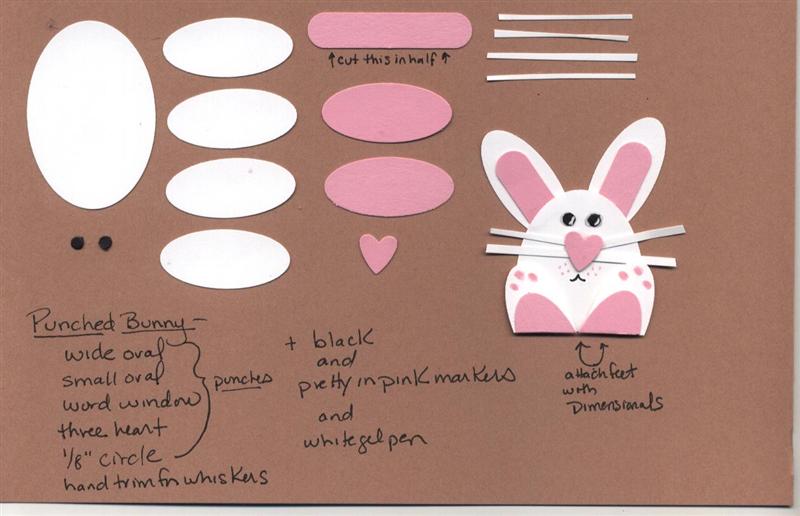 It’s quite fun and easy…maybe just a tad fussy to work with the tiny pieces, but worth it, I think! I highly suggest using a pair of tweezers.
For my April 15th afternoon class we’ll be making the Oval All card and the Sense of Time Bleach card along with a different third project (since it be after Easter.) I do have some openings for that class, so let me know if you’d like to attend.
I hope you’re having a great weekend. Thanks for stopping by.
-Jami
Faux Metal Class
September 14th, 2008
My class Friday night was a blast despite having a stressful day leading up to it. The technique we focued on was Faux Metal Emboss. This is a fun technique to play with and gives such an impressive result. The basic directions are as follows:
Start by choosing metallic cardstock and embossing powder to match (i.e. silver, gold or copper).
Faux Metal Emboss
ink your stamp with Versamark, cover with the embossing powder and heat emboss. Punch out your embossed image.
Variation – Faux Metal Impression Emboss
apply Versamark directly to your metallic cardstock, cover with ep and heat. Repeat this process 2 or 3 times so you have built up 3-4 layers of melted embossing powder. Before heating your last layer, ink you stamp with Versamark and have it ready to go. As soon as you have melted your last layer of ep- while it is still hot– immediately press your stamp into it. Press firmly and rock the stamp just slightly. Leave the stamp in place until the ep cools, then remove carefully. Punch out your image.
Friday night each person made a sample of each type for their technique reference cards and then made this card with the first type of FME –
Card base is Night of Navy, layered with Old Olive and Bordering Blue. Ribbon is red grograin. Faux metal embellishment is simply the Curly Punch image stamped with versamark on silver cardstock and embossed with silver ep. Baroque Motifs is used in the background.
Here’s another card I made to showcase the impression version of Faux Metal Embossing. It used the same colors along with Baroque Motifs, Garden Silouettes and Beautiful Borders.
I’ll be back to share the other projects we made in the next day or so. Lots of stamping excitement tonight/tomorrow…the September SCS Dirty Dozen Fan Club gallery opens tonight at midnight PST…Paper Trey Ink reveals new sets at midnight EST (the sneak peeks have been awesome)…and I’m pretty sure that Anna Wight will reveal her new Whipper Snapper sets at midnight CST. I can hardly wait to see what Anna has in store for us this time! I’ve finished up my time on her Featured Designer Team. Thanks Anna for the wonderful opportunity! I had a great time!
And now we need to eat a quick dinner and get to evening service. After church this morning we invited some people out to our favorite sandwich shop on the spur of the moment for lunch. It ended up being 4 families and we stayed there for almost 3 hours. We were having so much fun that we were that laughing *loud* group you hope you don’t sit next to in a cafe! LOL! Anyway – I got nothing done this afternoon…not even the nap I had planned. But it was totally worth it!
Thanks for stopping by – Happy Sunday!

August Stampin’ Up! Class
August 16th, 2008
Class was so much fun last night! I am so blessed to have such a great group of women for customers and seeing their excitement for the new catalog was a blast! Here are the cards we made last night (and you can scroll down two posts for the third project – a genie bag.)
The first card is an example of Faux Seersucker and it’s for my friends Leann and Bunny (using Garden Whimsy and a crimper). The idea came from this card on SCS by pidgesmom. Once I started playing with this technique I just couldn’t stop. I made three cards in quick succession and here’s the one I chose for class.
It’s soooooo easy! We stamped the images from Garden Whimsy in Pacific Point, Regal Rose and Kiwi Kiss and then the stamped panel was run through the crimper once and turned a quarter turn and run through again for a waffled seersucker effect. Everyone also stamped either 2 or 3 extra Rose ladybugs on a scrap of white and cut them out and popped them up on dimensionals and then covered them with Crystal Effects. The 5/8″ Regal Rose grosgrain is the perfect finishing touch. We also stamped a white panel for inside the card. Everyone chose a sentiment from Sincere Salutations to stamp in Pacific Point and accented it with the Rose and Kiwi ladybugs to give the card a really nice completed look.
I was telling the girls last night that this card reminds me of a favorite dress I had when I was about 9 or 10 years old. It was white seersucker with little embroidered flowers on it. I was taking ballroom dance lessons and I remember that summer wearing that dress to a party at the dance studio and feeling like I was all that! *grin*
This next card was my favorite of the evening – it’s so me!
This card is so simple (and yet elegant) that I don’t think it needs much explanation, but here goes…
The base is Old Olive layered with Riding Hood Red and Bella Rose designer paper. The two prints are opposite sides of the same sheet, so I just cut pieces 5″ x 4″ and then cut the 4″ into two pices at 2.25″ – the smaller piece was then flipped over and punched with the scallop edge punch. Everyone chose a letter from Lovely Letters (I’m so excited to finally have this set!) and inked it with Kiwi Kiss and added Olive marker to the leaves before stamping on Shimmery White cs. Then the stamp-a-majig was used to place the frame from Frames with a Flourish stamped in Riding Hood Red. (I found it much easier to stamp the letter first and then add the frame as opposed to the other way around.) That piece was hand trimmed and layered onto Old Olive and adhered with dimensionals over the 5/8″ Olive grosgrain ribbon.
Wouldn’t this card be great as a set to give as a gift? And they could be mass produced quite easily.
I hope you are enjoying your Saturday and that you’ll take a little time to stamp! I need to put away everything from last night and then I plan to plop down at my stamp table for a little play time. Thanks for stopping by.
P.S. my retired stamps for sale list is still active – just scroll down a bit. I also have one set for trade at the very end of the list – anyone want Heartfelt Thanks? I’m offering a good deal!
Whole Latte Shakin’
February 2nd, 2008
Class tonight was really fun. I’ve already shared 2 of the 3 projects we made tonight so I thought I’d pop in really quick before bed and show you the third project – a shaker card.

I’ve been teaching a monthly technique class for I think three years now and up until now I’ve avoided doing a shaker card in class. I have no problem making shaker cards, but for some reason teaching others to do it seemed a bit intimidating. Turns out it was pretty darned easy and I even had two newbie stampers tonight. I had this card in my head when I placed my new catty order last month. Pun Fun is going to be so great to work with and I love the little Sprinkes background set (see the hearts on the shaker frame?) We stamped the cup with Brown Stazon and watercolored it with ink from the pads and an aquapainter. Clear microbeads were used for the shake-stuff. 🙂
There are lots of ways to make the frame, but I mainly wanted to be sure my customers could do it on their own at home. I had them take the Cocoa cardstock and measure in 3/4″ on all four sides and draw lines all around. Then those lines were used as guides as they used a square punch to punch out the inside portion of the frame – they simply turned and punched 4 times. Then of course those lines were turned over to the back. I think everyone had fun and heck, who doesn’t love a shaker card?
I’m pooped. Good night. Thanks for stopping by.
Crayon Resist
November 19th, 2007
I had a few questions on the crayon resist technique I used on the cards in the previous post so I thought I would just go ahead and explain here. It was so late and I was so tired when I posted that last night that I didn’t give much detail, so I apologize.
For the crayon resist in the cards below I started with a 1/4 sheet of glossy white cardstock. I randomly stamped the flower and leaf images using SU Classic Black ink starting with the largest image and working down to the smallest. I actually tried Palette Hybrid Noir ink first, but the crayon smeared it even after some heat setting. I thought that was strange, but I went back to the old faithful SU pad even though the color seemed a little purple. I had read that Stazon doesn’t work and I didn’t really have time to try it out.
Once the images were stamped and the ink allowed to dry for a few minutes I used a white crayon to color in the areas that I wanted to end up highlighted in white. Again – I was really in a hurry and when my cards were all done I realized I had not done that great of a job with my crayon – I missed several places. You can also use a yellow or other colored crayon which would make it easier to see where you have colored and where you have missed. But since I originally learned the technique with a white crayon I have one set aside in my stamping stuff and just use that.
I then got out my sponge daubers. You can use daubers or just quarters of the round yellow sponges or you can even use a brayer for this technique, however to get the look I got on my cards you would need to use daubers. With the daubers I worked in the opposite order – smallest images to largest. For the tiny flowers I used Pumpkin Pie ink – inked up the dauber right on my pad and simply placed the dauber right over the little flower and twisted to get a dot effect. For the rest of the colors I did more pouncing. In the empty white space I sponged River Rock ink – which doesn’t show up so much in the photo, but makes a big difference IRL. The color scheme for this piece was inspired by my favorite Dashing Paper and I just added a little Pumpkin Pie as I was channelling Jenn Balcer a bit! LOL!
Once all the ink was applied and allowed to dry for just a minute or so the entire piece was buffed with a Kleenex – this removed the ink and the crayon from the white highlighted areas. Voila! The piece was then cut in half and trimmed to make 2 cards. You could also do this with a whole sheet for a One Sheet Wonder project, but I find that I prefer working in quarter sheets for crayon resist so I can better keep track of what I’m doing.
I hope this detail helps. if you haven’t tried the crayon resist technique grab some glossy cardstock and one of your kid’s crayons (who am I kidding? My crayon came out of my very own box of 64 Crayola crayons!) and get stamping! It’s super FUN! Let me know if you have any questions.
Don’t forget to check back tomorrow (Tuesday) morning for a special post!