Delightful Decorations
September 29th, 2009
I was in the stampin’ zone yesterday for the first time in a long time. Of course it was driving me crazy that I couldn’t yet share what I had created, so last night I got back in my stamp room and made 2 more quick cards, this time featuring Delightful Decorations from the SU Holiday Mini along with the coordinating punch. Both of these cards turned out to be SUO.
This first card was inspired by one I saw in blogland using Baroque Motifs – I’m so sorry that I now have no idea where I saw it. That’s why I love the gallery at SCS – I can put a card in my faves and go back and reference it and always give credit for inspiration. When I’m blog surfing I always forget where I’ve been!
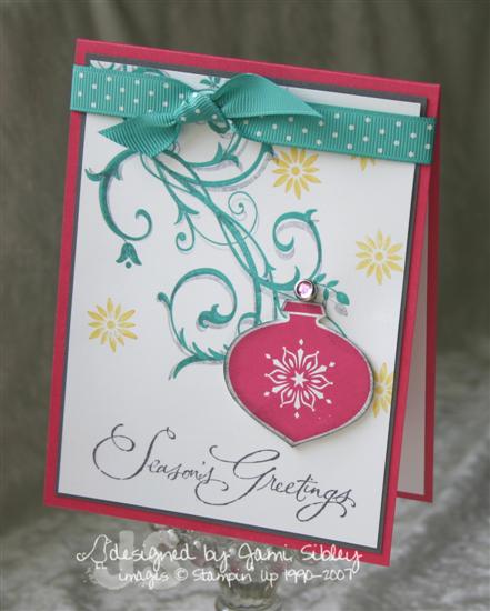
I wanted to use some non-traditional colors on this one. The motif is stamped in Bermuda Bay ink and then stamped again slightly off in Basic Gray ink to give a shadow effect. The little flower/snowfalkes are Crushed Curry and the ornament is Melon Mambo edged with a little Basic Gray sponging. The ornament was punched out and popped up on dimensionals and finished off with a pink rhinestone brad. The sentiment from Many Merry Messages is stamped in Basic Gray.
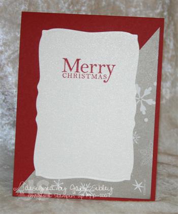
I love this next card and I wish you could really see the awesome shimmer here. I just couldn’t get a good photo, but you MUST try this new shimmer paint on a stamp – a real WOW!
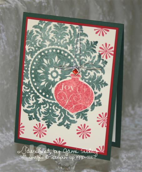
The medallion stamp was inked up with Handsome Hunter ink and the Frost White shimmer paint (from the Holiday Mini) was dabbed onto the stamp with a sponge. It was then stamped onto Very Vanilla cs. The ornament was given the same treatment with real red ink and the shimmer paint and then it was punched and popped up on a dimensional. It was finished off with a square red rhinestone brad and silver cording. Cardstock colors are Handsome Hunter and Real Red. This has a rich vintage look in person.
I’m running late for work so I need to dash. Thanks for stopping by.

A Dress for Tessa
September 28th, 2009
Happy Day! I accomplished all my must-do’s this morning and carved out the afternoon to stamp! YEA! Unfortunately I don’t have anything to share yet since everything I’ve done today features the new TE releases coming out this Saturday the 5th. I’m super excited about this release…I absolutely ADORE these sets! Sneak peeks begin Thursday from the Baker’s Dozen Design Team.
Although I don’t have any stamping to share I just had to show you the latest photos of Tessa. Her Auntie Denise gave her a pink dress and I promised to share the photos. You have to understand that Curt detests clothing on dogs and has forbidden it with the exception of a Halloween costume. But he just couldn’t make me turn down a gift. *GRIN*
I laughed so hard when I put this on her! It says Princess across the back.

Above was the best photo I could get of her. She’s pretty squirmy when it comes to photos. After many attempts, below is the look she gave me to say “enough is enough”. LOL!

So, where do you stand on dogs wearing clothes?
Thanks for stopping by.
TESC84 Places You’ll Go
September 25th, 2009
I’ve really been wanting to get back to some of my favorite styles of stamping – vintage, shabby, retro – so I decided to use Taylor’s sketch today (turned on its side) to try something a little vintage-y. This card went in a little different direction from what I had originally pictured and I’m still not quite sure how I feel about it.
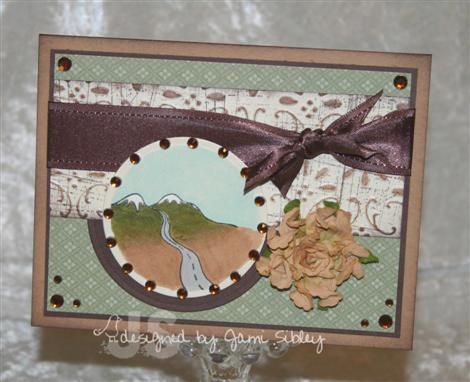
Mountain image from the TE charity set The Places You’ll Go was die cut with circle nesties and colored with Copics. I omitted the sentiment when I stamped the image with the idea that I would use a different sentiment from the set elsewhere on the card, but as you see I ended up *wordless* – I just couldn’t make a sentiment work anywhere. Card base is Creamy Caramel with the edges sponged with Chocolate Chip ink. Next is a Chocolate Chip layer followed by a layer of SU dp (from a Hostess pack). The ivory cs is shimmery poison ivory and the horizontal panel was first stamped in chocolate chip with the Sanded BG stamp, then run through my Big Shot with an SU embossing folder and brayered with Creamy Caramel ink. The finishing touches are chocolate chip satin ribbon, KaiserCraft rhinestones and that new big yummy Prima flower.
Now let’s see what the rest of the Sketch Crew has cooked up:
I hope you’ll play along with us – hop over to Taylor’s blog to get all the deets.
TESC83 Pearly Bird
September 18th, 2009
Happy Friday! Taylor’s sketch for this week may look a little wild at first glance, but it’s actually quite versatile and I can hardly wait to see what the Sketch Crew has come up with. I hope you’ll play along too. You can see the sketch and get all the details to play over at Taylor’s blog.
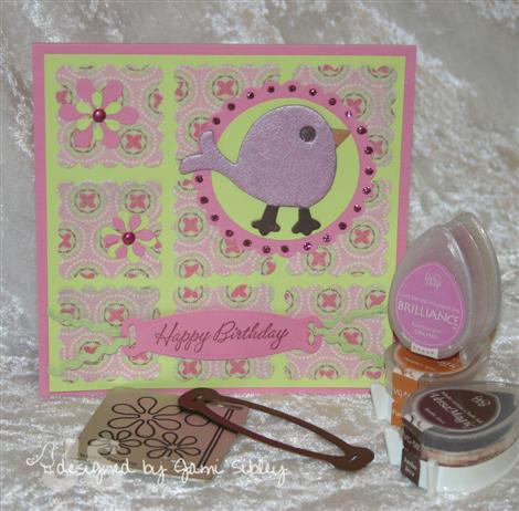
This card went in a totally different direction from my original intention, but it was one of those times where I just got a bunch of supplies out and started playing. The cardstock, designer paper, tiny brads and ric rac are from the TE Easter Key Ingredients which is still one of my favorites (oops looks like it recently sold out.) This card is 5″ square and the little blocks were created with my SU scallop square punch. The bird is SU chipboard and I covered it with the Pearl Orchid Brilliance ink and heat embossed it with clear ep. I used both Cuttlebug and Spellbinders dies along with Marvy circle punches. Pink Stickles are the final touch.
And now let’s see what the rest of the Sketch Crew has cooked up:
I’m hoping to maybe do something fun today. Curt has been working really hard – worked last Saturday and then had to be out of town part of this week – and he’s able to take today off. So I’m going to wait and see if he’d rather just chill today or go somewhere fun. Either way I’m just glad he got the day off. Thanks for stopping by. Have a great weekend.
More Cutlery
September 16th, 2009
Our church does a thing called Summer Sunday Nights on the Patio after the evening service for 9 consecutive weeks. It’s a supper time for some sweet fellowship. In the past it’s been just a few people doing all the work all Summer long. I had an idea to to form teams to get more people involved in the ministry and spread the work among more people, so I volunteered to head up the program this year. I recruited 8 team leaders (some of them worked in pairs) and together we recruited people to form teams of about 6 people for each week to do the shopping, cooking and serving. A good time was had by all – including the workers – and that made my heart glad. My team leaders were awesome and I wanted to send each of them a personal thank you note. Well, you just know what stamp set I had to use! Yep- Compliments to the Chef. I’ve already posted a couple of the cards I made, but here are the rest of them.
*
*
*
This first one uses Ruby Red and Not Quite Navy cardstock along with a retired SU dp (can’t remember the name of it). A very simple card with some NQN brads and some River Rock ribbon. (River Rock is the one retired In Color that I miss the most I think.) Image is stamped on Very Vanilla with NQN ink. I had used this dp a lot when it was currrent, but i don’t think I had ever paired it with any red and I really like the look of this.
*
*
Next is a group of cards all featuring the current Cottage Walls dp from SU. My original intention was to make at least 4 cards all the same, but since I really hate doing production stamping like that I ended up making them all different which was so much more fun. I kept them really simple since I needed several and had limited time.
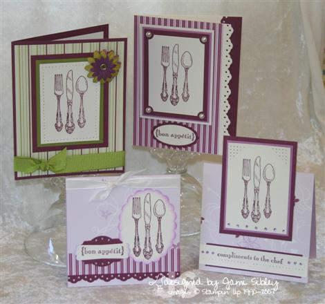
I used a combination of Rich Razzleberry, Orchid Opulence, Pale Plum and Old Olive cardstock along with Very Vanilla. All of the images are stamped in Rich Razzleberry. I had fun playing with a variety of embellishments like KaiserCraft pearls, Taylor’s Tiny Twinkles, Prima flowers and of course ribbon and punches.
So have I convinced you yet that you really do need this set? LOL! I know I’ve justified my own purchase for sure!
Thanks for stopping by. Hope you are having a good week. Curt just called to say he’s on his way home a day early from a business trip so I’m a happy happy girl!
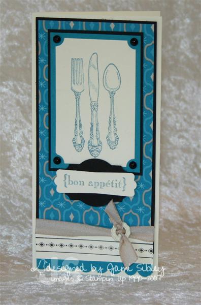
Bon Appetit
September 15th, 2009
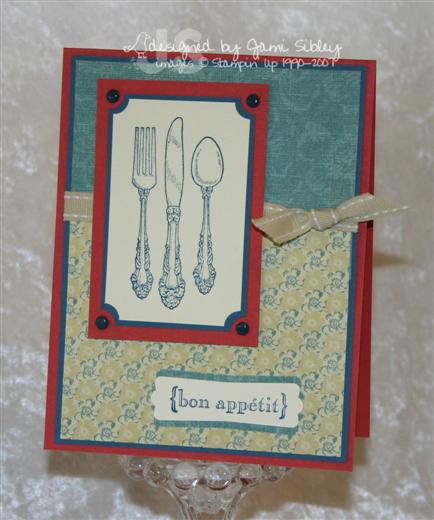
I’m home today dealing with an ear infection and just waiting for the meds to really kick in. I wanted to share the 3rd project from my Stampin’ Up! Class last Friday.
This card is sized to fit into a small open ended envelope and it’s one of my favorite non-standard sizes to work with. I just love this set – Compliments to the Chef – and had to use it for class. This would make a great thank you card or invitation. Tomorrow I’ll be back with a bunch of thank you cards I also made with this set.
Here I used Very Vanilla for the base as well as to stamp the images on. The dp is Holiday Lounge and I think it’s great for stuff other than Christmas. It’s got a very cool retro vibe. I used Taken with teal ink and cardstock along with a bit of black. The ribbon is Kraft Taffeta and it’s pulled through a Vanilla ribbon slide from the Hodgepodge Hardware kit.
Thanks for stopping by.
TESC82 Christmas Candies
September 11th, 2009
Happy Friday! Looking forward to my Stampin’ Up! Class tonight and looking forward to the weekend. It’s been a looooong couple of weeks – I hope to have resolution soon and be able to talk about it here. (I really haven’t felt like blogging much.) In the meantime I was excited to finally ink up my Sweet Centers set and play with Sweet Treat Cups.
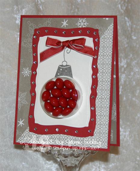
My original thought followed Taylor’s sketch very closely since I generally take sketches pretty literally, but the final version of the card veered from the sketch just a bit. When I went to the store today I intended to get Red Hots to make this card, but they didn’t have any so I ended up with Skittles (I picked out the red ones). The red Skittles (btw – I determined that 13 was the optimal number to use) seem to work best with Riding Hood Red. The dp is Christmas Cocoa Specialty. This particular sheet has a pearly metallic sheen in kind of pewter color – not quite silver and not quite gold – very pretty!
I used the Spellbinders Curved Rectangles for the image panel and matting. I wanted to keep it really simple, but felt like it needed something. Taylor’s Tiny Twinkles were the perfect little sparkly touch.
I hope you’ll play along with the TESC with us this week. You can see Taylor’s sample and get all the deets to play by hopping over to her blog. And be sure to take a look at what the rest of the Sketch Crew has created as well:
If you played in any of the Taylored Expressions Birthday Bash Challenges be sure to check out the SASI Blog today for the announcement of all the winners.
–
–
–
–
–
–
–
–
I’m also excited to introduce Sweet Centers to my class tonight. We’ll be making a Halloween card.
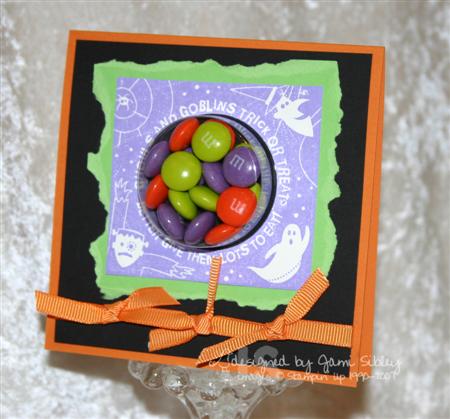
This card is 4.25″ square and this time I used Halloween M&M’s (the optimal number of M&M’s seems to be 17.) I decided to tear the Green Galore layer for a little more *spooky* look. The image is stamped in Lovely Lilac ink. Of course the color scheme is taken from the M&M’s. Super simple, but really cute I think.
Hope you have a fantastic weekend. Thanks for stopping by.