TESC111 A Sketch for Mother’s Day
April 30th, 2010
Happy Friday (Note to Mom – if you are reading this before Mother’s Day, please look away immediately and close 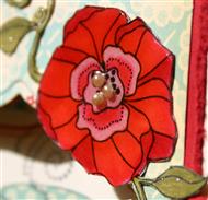 this post. Thank you.) It’s time for another sketch from Taylor (TESC111) and *WOW* I really like this one a lot! I tend to be pretty literal when it comes to sketches, so for this the one the first thing I told myself was that the circle element does NOT need to be a circle…let’s think Nesties. Hmmm…that led me to think of the Labels 9 image in CreativiTEA by Taylored Expressions and I was off and running. I’m not sure what possessed me to create a window in the card…not something I have done very often…but I love it!
Red is one of my all-time favorite colors and since painting my kitchen red, I seem to be using it even more often in my stamping. I was so super excited to pull out my new favorite line of paper Thrift Shop by October Afternoon!
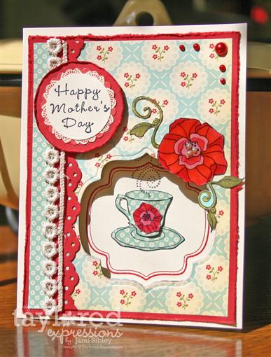
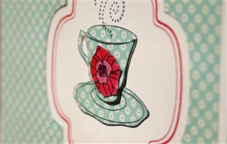
Card base is TE Choice Buttercream. The front is layered with Real Red (with distressed edges) and 2 patterns from Thrift Shop. After cutting the window with Spellbinders Labels 9, I stamped the label image in Real Red ink on the inside of the card. The cup was then stamped and paper pieced.I cut out part of an additional cup so I could pop it up for some dimension. Then I stamped the patterned cup and colored in the flower on it, cut out the flower and adhered it to the paper pieced plain cup. Make sense?
The large flower was stamped, colored with copics, cut out and covered with Crystal Effects. I added some Sakura glitter pen to the leaves.
The sentiment is from TE Fresh Flowers. It was punched with a circle punch and layered onto another pattern of Thrift Shop paper and then onto a red cardstock circle and popped up on double thick foam tape. Additonal elements include red KaiserCraft pearls and Crochet trim from TE.
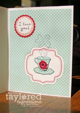
My original intention was to be done at this point, but somehow I smeared some ink on the inside of the card. Uh-oh! No worries – let’s just cover it up with some more of this yummy yummy paper and cut another window!
*
*
*
And now it’s time to see what the rest of the Sketch Crew has done with TESC111.
- Alice Wertz
- Jami Sibley
- Lisa Hjulberg
- Lori Craig
- Lynn Mercurio
- Melissa Sauls
- Monika Davis
- Rachel Sztonyk
- Sherrie Siemens
- Taylor VanBruggen – see her sample and the sketch and get all the info so you can play along with us!
I’m looking forward to a visit from a very special friend this weekend so I have lots to do around the house today – most especially getting my stamp cleaned up so there’s room for two! *GRIN* I hope you have a fantastic weekend! Thanks for stopping by.

Medical School Graduation
April 29th, 2010
Happy Thursday. How the heck did it get to be Thursday afternoon already? This week is just flying by! Today I worked with my friend Lisa and her mom, Jan, to make 20 invitations to a party Jan is hosting for her son’s graduation from medical school. Lisa and Jan asked me awhile back if they could book a *private class* with me to make these invitations. At the time I had no idea how hard it could be to find nice graduation images. Boy was I ever thrilled when Flourishes released Hats Off to You just a couple of weeks ago! It was perfect!
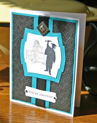
I e-mailed links to samples from the Flourishes Design Team blogs to Lisa and Jan. Jan immediately liked a beautiful sample (seen here) by my friend Leslie Miller, but in a slightly different color scheme. I was thrilled to use Leslie’s card as my jumping off point in designing these invitations. This is my first time working with Flourishes stamps. Although I love many of their images, I am not a fan of clear stamps at all so I’ve held off purchasing. I have to say that they are very high quality and stamped beautifully. And I’m looking forward to playing with Spring Bouquet which I fell head over heels for when I saw the design team samples. I asked Lisa to throw it in her cart for me when she was ordering Hats Off. *big grin*
Card base is Flourishes white cardstock, followed by a Taken with Teal Layer and then a black layer that was run through the Big Shot with a CB Argyle folder.
*Tip – when you have a layer that will be totally covered up, take the opportunity to die cut any layering shapes you might need before you adhere any layers together. In this case we die cut the Spellbinders Labels Two from the center of each teal piece and saved a ton of cardstsock that way.*
Sentiment is punched with the SU Modern Label punch and embellished with Basic Grey Bling. Black satin ribbon makes a nice texture contrast while still keeping the elegant masculine feel. The finishing touch is a decorative brad. We actually did about 12 that were grad caps and diplomas, but we couldn’t find enough for the 20 cards we needed and I happened to photograph one with a different decorative brad we used for the rest.
Lisa’s husband is a graphic designer and he did a beautiful job on the inside.
Thanks for stopping by. It’s almost time for me to get dinner going. I haven’t quite decided between tacos, burritos or nachos…it’s basically all the same stuff. I’ll be back in the morning with a sample for Taylor’s sketch. It’s already done and photographed (which is a rare thing on a Thursday afternoon) so I’m feeling really good! Have a great evening.
TESC110 No Stamps
April 23rd, 2010
Happy Friday! It’s been a busy week and I decided to try a “quick card” for my TESC sample this week. Y’all know I’m not much of a “quick card” gal, so I have to admit I’m not overly thrilled with this card. Really it was cuter in my head.
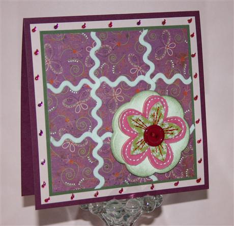
Designer paper and Bloomer is Basic Grey Green at Heart. Rather than use small separate squares in the layout I decided to try some stick on ric rac. I used Tiny Twinkles from the Multi-color shaped pack. Cardstock is Razzleberry, Pink Pirouette and Artichoke. No stamping here. Finished card size is 4.25″ square.
Time to see what the rest of the Sketch Crew has created and then head over to Taylor’s blog to see her sample and get the sketch so you can play along with us!
I’m hoping to have a catch up day today…laundry, straightening up, errands, etc etc. And maybe, just maybe, a little time to stamp. Hope you have an fantastic weekend!
New Crafter’s Workshop at Taylored Expressions
April 20th, 2010
Happy Tuesday! Taylored Expressions is hosting a blog hop today to showcase the new Crafter’s Workshop stencils now available. You’ll have a chance to see a few of the many opportunities for creativity in using these fun stencils by checking out several different blogs today. There are so many ways you can go with these stencils I can hardly wait to see what each person came up with.
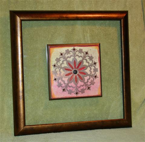
I chose to work with the Daisy Doodad Template as I had an idea for it as soon as I saw it. If you’ve been reading my blog for any length of time you know that we’ve been doing lots of redecorating in our house over the past year. One of the things I’m still trying to complete is getting art hung on the walls. Back in January I went to Home Goods with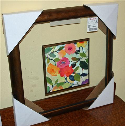 my very talented friend Kim and picked up a number of home decor items. Included in those items was some art that I planned to alter. I bought two of these pieces at $14.98 each. It might be a little hard to see in the photo, but the art work is mounted on a wood piece that floats on a sheet of glass framed by a bronze tone wood frame. I didn’t care much for the actual art and planned to replace that when I bought it. The art piece is 6″x6″ and the frame is 13″x13″.
Here’s a photo of the pair.
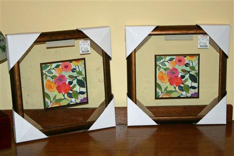
And here it is finished. I did finish both pieces, but unfortunately one of the frames broke as I was taking off the cardboard corners which were apparently stapled on by gorillas. Curt says he can fix it, but I couldn’t handle the piece to photograph it – so just know that there is a pair.
The really fun thing about this project was that I had no idea what exactly I was going to do. In fact my first attempt didn’t work out AT ALL. I really just played over a couple of days and ended up with this. So here’s the basic process I went through.
- I started with some paper from a big watercolor pad I purchased quite awhile ago. It’s quite heavy and I knew it would withstand a lot of *working*.
- First I scribbled watercolor crayons to cover my 6×6 piece of watercolor paper. I used Burgundy, Rose Red, Ruby Red, Saffron, Artichoke and Moss to coordinate with my decor.
- Then I washed all of that with my aquapainter, added a little more crayon and brushed more water.
- The whole piece was then covered with Gold Maya Mist
- Then I moved on to some Twinkling H2O’s. I splattered some of that on with a toothbrush and I painted the edges with 2 colors.
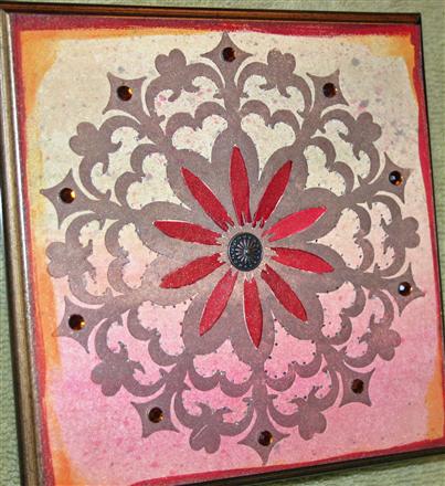
- Finally I get to my stencil! I covered my stencil with Brilliance Pearlescent Chocolate ink by simply taking the dew drop and patting it all over the stencil.
- I placed my painted background piece (still just slightly damp) face up on the platform for my Big Shot and then laid the inked stencil face down on top of it. I covered that with a piece of scrap cardstock before running it through the Big Shot. This acted as a letterpress and the stencil was embossed into the paper and a beautifully inked impression was achieved at the same time.(The ink washed off the stencil easily with running water in the sink.)
- I painted the petals with Twinkling H20’s ad added a decorative brad to the center. It’s hard to see in the photo, but I added piercing around much of the design. The piece was finished off with some KaiserCraft rhinestones around the edge of the design.
The combination of Twinkling H20’s, Maya Mist and Brilliance Pearlescent ink makes this piece very shimmery IRL!
I’m so excited that I got to play along today!!! Now I’m dying to see what everyone else did. How ’bout you….you coming?
- Alex Maldonado
- Carolina Buchting
- Charmaine Ikach
- Jackie Pedro
- Jeanie Witmer
- Jodi Collins
- Karen Giron
- Karen Motz
- Melissa Sauls
- Sankari Wegman
- Taylor VanBruggen
At only $3.99 each these stencils are a steal and I’m pretty sure you’ll need more than one! *wink* Thanks for stopping by! I’m on my way to the office soon. Hope you have a wonderful day!
TESC109 Mini Chill-ax
April 19th, 2010
Happy Monday! I hope you had a great weekend. My class Friday night was a blast! I have THE BEST group of stampers – so much FUN! If you’re in the area and would like to be included on my class e-mail list please click the “contact me” button and drop me a note. I’d love to have you join us! I wanted to share another one of the cards we made. After making the tall coffee card for Taylor’s sketch on Friday, I was inspired to make a mini tall card (3.25″ x 6.5″ to fit in an SU small open ended envie) using the same sketch for class.
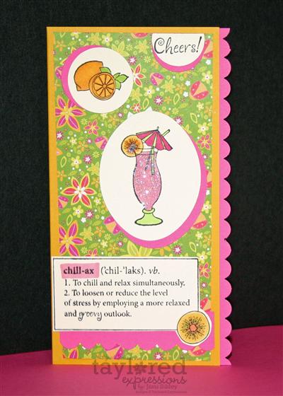
I had this super bright and fun K&Co 8×8 pad (Berry Sweet) that I had picked up at Joann’s so I paired it with Crushed Curry and Pink Passion. Chill-ax from Taylored Expressions was the perfect fit for this bright paper and fun sketch. A lot of my girls are totally new to Copics so this was some easy copic coloring to play with. We used a Marvy oval punch and some SU circle punches and scslloped border punch. The drink was covered in Dazzling Diamonds glitter.
This sketch might seem a little challenging at first glance, but it’s actually quite fun and easy. I hope you’ll give it a try this week. I have one more class project to share, but that will come later in the week. Tomorrow I have a special home decor project to share…assuming I finish and photogrpah it today. 😉 Thanks for stopping by.
TESC109 Tall Coffee
April 16th, 2010
Happy Friday! I’m so happy to be feeling better and looking forward to my stamp class tonight! I missed out on the Taylored Expressions Sketch Challenge last week, but I’m back for today’s really fun and different sketch. I started out thinking I would make a mini tall card, but once I got to work with the images from Let’s Do Coffee I realized the card would need to be slightly larger. I ended up with 8.75″ x 4″ – just a little shorter than a standard business size envelope.
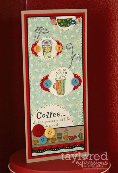
Card base is Kraft cardstock and is layered with Real Red, Black and dp from the October Afternoon Thrift Shop 8×8 pad (love love love this paper collection!) The size of the dp is what determined the overall height of this card which started out at 9″. Two of the cups were paper-pieced and the others were colored with Copics. All 3 of the large cups are covered with a heavy coat of Glossy Accents. I used various punches, some buttons from my stash and some Zva flourishes for this playful layout.
I’m anxious to see what the rest of the Sketch Crew has come up with – let’s go check ’em out!
Thanks for stopping by. I hope you have a wonderful weekend. I’m pretty sure mine will be better than the last one! 😉
Off the Couch!
April 14th, 2010
Poppin’ in for a quick post. I’ve been sick on the couch since Friday. Curt was sick all last week starting Easter weekend and I started feeling it last Thursday (just as he was starting to feel a bit better)…woke up with it in full force on Friday. I don’t know what the heck it is/was, but today was the first day I’ve even felt like sitting up at the computer or stamp table for a little while. I grabbed the opportunity to stamp and worked with the Sketch Challenge today on SCS. I have a class coming up on Friday evening and I thought this sketch would be perfect for a class card. I so loved that yellow/gray/white card I posted a couple of weeks ago that I decided it would be fun to do something along that line for class too.
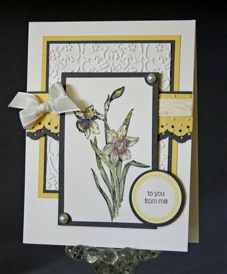
It’s not the greatest photo as I really didn’t feel up to fiddling with it a whole lot, but hopefully you get the idea. The daffodil image is from the SU Easter set, the sentiment is retired SU and the circle frame image is PTI. Cardstock is white, Basic Gray and Barely Banana. Image was colored with watercolor crayons and a little Smooch Illuminate was added.
I still have a couple spots open for class, so if you’d like to come please let me know by Thursday evening. Registration is $15 and we’ll be creating 3 projects.
Thanks for stopping by. Hope you’re having a great week!