Rock’n’Roll…literally!
July 29th, 2008
You may have heard that we had a little earthquake today in SoCal. The epicenter was about 40 minutes away from where we live and it was rated as a 5.4. I’ve lived in SoCal my whole life and have been through lots of earthquakes including Northridge and Whittier Narrows (both much bigger than the one today) and I can honestly say that they have never scared me much. But the one today really rattled me for some reason. It was the long rolling type and I do think those are scarier than the shaking/jolt type, but maybe it’s just my age. I don’t know, but I was pretty freaked out  – especially when there was trouble with phone service right after it happened. Thankfully there have been no injuries reported and very minimal damage. Everything at our house seems just fine.
The sentiment on the card I have to share today seems quite appropriate “Count your blessings one petal at a time.”
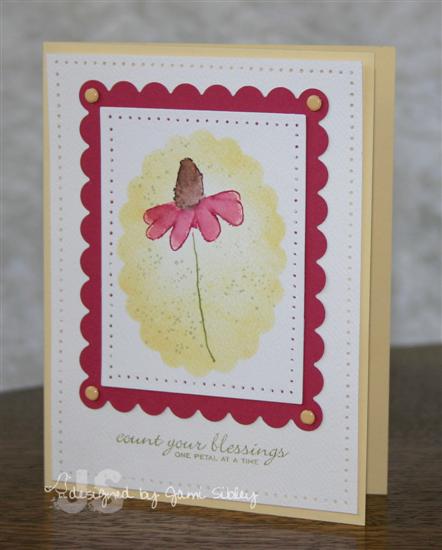
This is another card made with Blossoms & Butterflies and Blooming Expressions by Anna Wight for Whipper Snapper. I wanted to keep this card really simple and fresh, but still include some pretty details. I started out by faux framing the cone flower by punching a scallop oval out of a piece of scrap paper and attaching to my cardstock (I used a thin watercolor paper to stamp on here) with removable tape. The flower image was colored with markers and stamped inside the oval and then Barely Banana ink was sponged all around the flower getting heavier at the edges of the mask. I then watercolored the flower with markers and an aquapainter and added specs with Itty Bitty Backgrounds (SU) before removing the mask. I used my piercing tool and mat pack to pierce holes around the focal panel and the white background panel. The focal panel was layered onto a piece of Rose Red cardstock cut with a rectangle scallop nestie. Banana brads were added and the whole panel was layered onto a Banana card base. Banana and Rose Red is one of my favorite color combos. 
Thanks for stopping by.

Maybe Less is More….
July 28th, 2008
Bet you never thought you’d hear me say that! LOL! I have to admit that there IS one area where Less really is More…and that area is ME! I have put on quite a bit of weight over the last couple of years. It started out as a way to deal with grief (gotta love that comfort food!) and then just tumbled into out of control portions, ridiculous frequency of fast food and an insatiable sweet tooth. I’m a Lifetime Member with Weight Watchers having lost 50 pounds on the program over 10 years ago (after being quite thin most of my life) and still believe it’s the best thing going, but I just couldn’t get a handle on it this time. So Curt and I decided to try Nutrisystems with the idea that we would do that for 2-3 months and then get back on WW once I felt I could make good choices again.
Well today marks the start of my 4th week on Nutisystems and I weighed today for the first time since my initial weigh in on the very first day. I typically lose weight fairly slowly and was prepared for a loss of hopefully 2-3 pounds in this first 3 weeks, so imagine my utter delight when the scale showed a loss of 7 pounds!!!! I’m so excited I can hardly stand it! 
I want to lose a total of 55 pounds and get back to the thin me that still exists in my head. This is a very encouraging start to what I realize will be a long road. I’m sure many of you are in the same boat and I hope this is an encouragement to you as well. I will post periodic updates and y’all along with my hubby can help keep me on track with the goal in sight. If you have questions feel free to ask!
I do also have a card to share tonight.
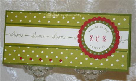
I made this card to send a welcome to Sean at NameMedia – the company that bought out SCS. I wanted to keep it masculine and still fun so I used the polka dot dp from Bella Rosa in Kiwi. The focal image is made with the JustRite Stamper. I dry embossed little dots along the top and bottom edges of the white strip of cardstock, but I couldn’t get them to show up in the photo. They really do make a big difference in the overall look of the card IRL. This started out to be a monochromatic card, but then I just had to add in the Ruby Red! If you’d like to send a card to Sean (we’re trying to flood his mailbox at NameMedia) here’s where to send it to:
Sean Polay
NameMedia
230 Third Avenue
Waltham, MA 02451
I was as freaked out as anybody when I first heard of the acquisition, but have since been reassured and feel confident that this will be a good thing for the SCS community overall. If you haven’t read the story on the home page of SCS along with the thread Daven started from there, be sure to go check it out.
Tomorrow I work and then in the evening I’m going to see Mama Mia with some girlfriends. Should be a good time! Thanks for stopping by.
Tea, Flowers, New Shoes
July 26th, 2008
Warning:
the following is a rambling NSR post ’cause sometimes I just have stuff to say.
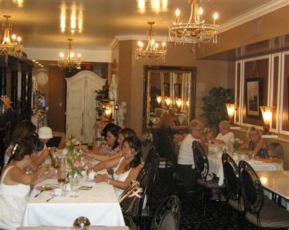
I love going to tea and have for many years. It’s not the tea I love (although it’s nice enough) it’s the experience. Sitting in a beautiful tea room and being served pretty and tasty food in dainty morsels that still fills you up…and most importantly relaxing with friends. I hadn’t been to tea in about a year, until this past week when I got to go twice. How cool is that?
Last Sunday I went to Vintage Tea Leaf with PACT (my women’s prayer group). Each year we get together to go to tea to celebrate all of our birthdays. We each buy a special birthday gift for one other member of the group.
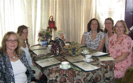
Vintage Tea Leaf is my all-time favorite tea room. It has mostly traditional English Victorian style and one of my favorite things is the large selection of beautiful china teacups where Beverly invites you to choose one to sip from for the afternoon. We had yummy moist scones and a wide variety of tea sandwiches along with three different pots of tea.
Vintage Tea Leaf is located in Long Beach and the tea we selected – 2 scones and your choice of 4 pair of tea sandwiches along with unlimited pots of tea – was $20 an average fair price.
Then on Friday I was asked to go to tea with two girlfriends I hadn’t seen much of in awhile. We decided to try a fairly new tea room called Paris in a Cup. It has a Parisian Salon feel and the decor is absolutely beautiful! Their menu is just slightly more varied than most tea rooms and includes coffees along with the hot and iced tea choices.
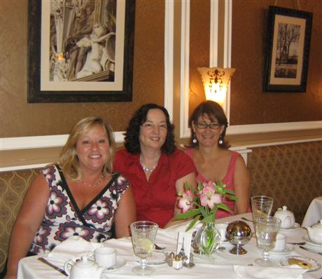
The scones were small, but wonderful. They had vanilla cream and orange chocolate scones the day we were there. Those of you who know me, know my ban on chocolate touching or being mixed with fruit so I requested two vanilla and they accomodated me. Kim and Judy said the orange chocolate was quite yummy and I looked the other way.
Paris in a Cup is a tea room I will definitely go back to. It is located in Old Towne Orange amongst all the boutiques and antiques shops and is a little more expensive than VTL. We choose to have scones, tea sandwiches (we were served 3 as opposed to the 8 at VTL), a small cup of soup, and cookies (the cookies were the only disappointing part) for $23. Although it doesn’t sound like a lot of food we were all quite full when we finished.
After tea we walked around and shopped a bit and I purchased a vintage tea towel in the colors I hope to re-do my kitchen in. It will be a great inspiration piece. As if all of this didn’t make for a nice enough day, I returned home to see flowers left on my front porch with a very sweet note from an out-of-state friend.
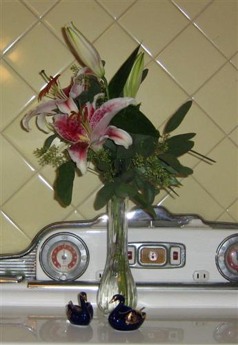
Another one of the lilys has opened up since I took this photo. I was just blown away by this thoughtfulness.
While at tea on Friday talk turned to shoes (and afterall what would a tea be without some discussion of shoes or fashion). My friend Judy was telling us about some red shoes she had found at an awesome discount store. Well, wouldn’t you know that I have been looking for red shoes and what she described sounded perfect. Today Curt and I needed to go to Costco and I talked him into taking me to find this shoe store first. It was a HUGE store and I think Curt started to quake in his boots when we walked in the door. It was the kind of store I could spend all day in. I promised to hurry and he was such a trooper. He went down every aisle with me to help me scout out what I was looking for. I never did find the shoes Judy told me about, but no worries, I ended up with super cute red shoes just the same.
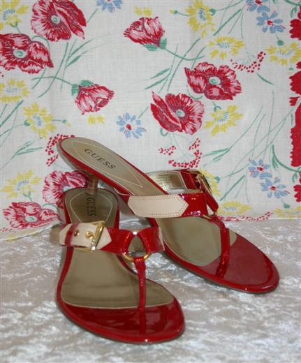
Check out these adorable low healed red sandals by Guess! There’s just nothing better than a pair of new red shoes! Oh and in the background is the vintage tea towel I mentioned earlier – so pretty! I’m excited because I got a new Liz & Co. skirt and top outfit about a week ago and I even bought jewelry to match. Now I have the shoes. I can’t remember the last time I had a whole new outfit including jewelry and shoes. I’ll be stylin’ for church tomorrow – not that that’s what it’s all about, but it doesn’t hurt! LOL! I’ve been missing my best friend Ruth (she lives in WA now). No one shops like Ruth! Since she moved (oh and since I’ve put on weight) I just have a harder time pulling together whole outfits with all the accessories. So Ruth…know that I bought these shoes with you in mind.
For anyone still reading – thanks for indulging my ramblings and I hope you’ll make reservations to go to tea with some girl friends really soon! Don’t forget tomorrow (Sunday) is the last day of new challenges being posted for DTGD. Then you’ll have another week or two toplay and catch up.
Thanks for stopping by.
Jami
SU Sneak Peek and DTDG
July 26th, 2008
It’s Saturday and the Dare to Get Dirty Challenges are continuing. I had the pleasure of being a sample maker for Jen del Muro (genie1314 – the oh so fabulous creator of the Genie Bag) for her challenge today. You can check it out in the Challenge Forum here. For today’s card I was very excited to play with some of Stampin’ Up Sneak Peek stuff!
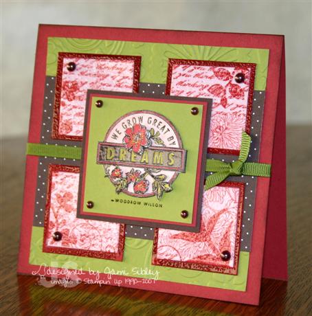
I couldn’t wait to dive into some of the new colors along with sets Dreams duJour and Fresh Cuts. The Riding Hood Red card base is 5″ square. The Kiwi panel appears to be a 4.5″ square, but I actually cut it into two pieces so that I could run it through my Cuttlebug to emboss the pattern. The polka dot chocolate brown dp is from the new Bella Rosa (love it!).
I stamped the main image from Fresh Cuts on Pirrouette Pink with RHR ink and then cut it into four pieces and leyered them onto RHR mats. For a little added touch I heat embossed each square with versamark and clear ep to give the effect of tiles. The main image was stamped three times and watercolored and then carefully cut out and layered with foam tape (paper tole.) I’ve always loved the look of paper tole and it’s really not hard. 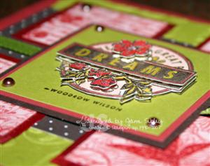 This image was a little tedious to cut, but generally this is a pretty easy technique with a WOW result. The final touches are olive grosgrain ribbon and Kaiser Craft chocolate pearls in two sizes. I think this card very much represents my More is More style. It’s not so much a matter of always adding *more stuff* – sometimes it’s just in the details of layering and texture like the CB embossed panel here and the clear heat embossed tiles along with the dimension of the paper tole on the focal image.
I hope you’re having a great weekend and have some time to stamp! I plan to be back later today with some pictures of my tea adventures this week. Please remember to check out the Midwest Flood Relief Non-Raffle on SCS and make a donation if you can. Thanks for stopping by.
Double Challenge Friday!
July 25th, 2008
Happy Friday everyone! It’s time for another TECC (Taylored Expressions Cupcake Challenge – cucpcakes not required) Sketch. AND my card for today pulls double duty as Taylor is also hosting a DTDG challenge on SCS today. I won’t tell you what that challenge is, but I know you’ll want to play – so go check it out – click here.
I am really loving today’s card! I just had so darned much FUN with it!
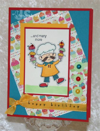
This was such a cool sketch and I have been dying to use my little Inky Antics Cupcake Chef by Ronnie Walters ever since I got it from electic Paperie a couple of weeks ago! Isn’t he so adorable!?! I saw this stamp line at CHA back in January and have been waiting all this time for eP to get them. You know I love My Friend Ronnie and this chef line is by the same artist.
When I saw the sketch I knew I wanted to use a designer paper for the askew panel. I remembered the 6×6 Junkitz Salsa pad and just hoped I still had some of the cupcake pattern left. Sure enough – yea!!! This bright happy paper determined the color combo for the entire card. I actually first colored the chef with Copics to coordinate with the paper and then built the cardstock layers from there. The card base is Real Red, layered with Taken with Teal. The focal image is matted on Real Red and accented with Summer Sun.
Here’s a photo of supplies I used (click on the photo to see it larger) 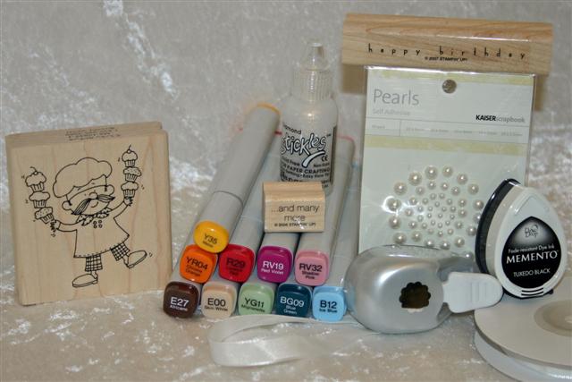
For embellishments I used white Kaiser Craft pearls and colored them with Copics before layering them onto Gable Green tiny scallop circles (see punch in the photo above). The cupcake frosting is covered in Diamond Stickles. I struggled for awhile with the sentiment at the bottom before I got the brainstorm to stamp on the ribbon. The ribbon is SU white taffeta colored with a Copic marker. I’m so excited to custom dye this ribbon since I discovered how well it takes the Copics. I’m going to need to order a lot more of this white tafetta!
Here’s the sketch:

For those of you who like measurements here’s what I did:
card base 5.5″ x 4.25″
teal layer 5.25″ x 4″
dp layer 5″ x 3.75″ – turn it askew and adhere to teal layer, then trim off excess corners with scissors or paper trimmer
main image 2.25″ x 3.25 (and add 1/8″ for the red mat layer)
summer sun accent layer 2 -3/8″ x 3-1/8″
Head on over to Taylor’s blog for all the challenge rules and find out how you could become her Featured Stamper next week. This week’s Featured Stamper is Denise Marzec (peanutbee on SCS). You’ll get lost in her awesome gallery!
And now let’s do a little blog hopping to see what the rest of the Cupcake Crew has cooked up this week!
Ana Wohlfahrt: Ink A Stamp
Stephanie Hargis: Steph’s Stampin’ Stuff
Vicki Chrisman: This Art that makes me Happy
Monika Davis: M.A.D. Stamper
Lynn Mercurio: Stamperosity
Sherrie Siemens: Card Creme
Would you like to make a donation to help out the Midwest Flood victims? Well, allow me to direct your attention to another HUGE event taking place at SCS right now the Splitcoast Non-Raffle for Midwest Flood Relief with all proceeds going directly to the Red Cross. Make a donation and get a chance to win some incredibe prizes. You absolutley MUST go take a look at all the fabulous prizes that have been donated! What a wonderful way to help out and show you care!
I hope you have a great weekend and I hope you take some time to stamp. I got to go to tea with my Prayer Group last weekend and believe it or not I get to go again today (to a different tea room) with another group of friends. There’s just nothing like an afternoon at a tea room with friends! I’m off – tah tah!
Simple Elegance
July 24th, 2008
Even though I stamped quite a bit yesterday, I didn’t manage to get anything posted. The good news is that I have several cards now ready to share over the next few days. For today’s cards I combined two of the DTGD Challenges – Jody’s ribbon challenge and Sharon’s challenge to stamp simply.
I started by going through a bag of velvet ribbon that was a much appreciated and very generous gift from Jody when she came out to visit California (she does incredible ribbon shares if you haven’t heard!) I LOVE velvet ribbon, but don’t use it very often I think because it seems so *special*. So This time it was fun to start by choosing the ribbon. From there I looked through designer papers and found this beautiful blue and green print in the Basic Grey Two Scoops 6×6 pad. I knew I wanted to make something with a simple elegance, not too fussy. Sharon Johnson makes this style look so easy, but I tend to have a hard time with it. I reached for Anna Wight’s Whipper Snapper sets Blossoms & Butterflies and Blooming Expressions and I got to work on a very simple card. Besides the yummy ribbon the only embellishments are clear Taylor Tots at the bottom, white gel pen dots on the scallops and some sparkle with a Spica Glitter Pen on the leaf image. The dp is layered onto white cardstock and the entire panel is mounted with foam tape to allow for the thickness of the ribbon tied around the panel.
Recipe:
Stamps – Whipper Snapper Blossoms & Butterflies, Blooming Expressions
Cardstock – Wild Wasabi, White, Basic Grey Two Scoops 6×6 pad
Ink – Wild Wasabi, Soft Sky
Other – white gel pen, rectangle nestabilities, blue velvet ribbon, Taylor Tots, foam tape, Spica Glitter pen
Finished card size is 6.25 x 3.5 – a mini tall card. I love working with this size card. So have you been playing DTGD this week? How many cards have you made? What has been your favorite challenge so far?
Be sure to join me tomorrow for Cupcake Friday! 🙂
Dare to Get Dirty Week ’08
July 22nd, 2008
It’s Dare to Get Dirty week at Splitcoaststampers and there are multiple challenges to play every day through Sunday. I really wanted to play yesterday, but it just never happened. For today’s challenges I started with JulieHRR’s because I have been dying to get out some Fabriano notecards and make a set of some sort. I made a set of notecards just about every month I was in the Dirty Dozen, so this seemed very appropriate for DTGD08.
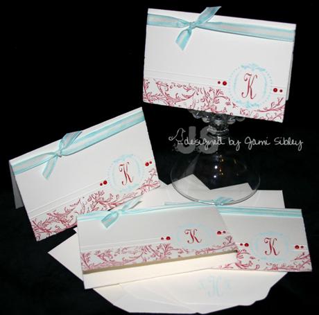
I recently got the Just Rite Monogram stamper and some accessory sets and I’ve been dying to play with them. I’ll be going to lunch with my friend Kimmie on Friday and her birthday was a couple of weeks ago so this will be the perfect little gift for her.
The monogram was stamped by inking the “K” with a Stampin’ Up! Real Red marker and the border was inked with Versamagic Dew Drop Chalk ink in Sea Breeze. After stamping the monogram, I added the two score lines using my Scor-Pal. Then I masked off the top portion and the monogram with Eclipse masking tape and stamped the SU retired background Filigree in Real Red ink – I still love that background!
I didn’t have exactly the ribbon I wanted so I created some using SU ivory taffeta ribbon and my BG02 Copic marker which coordinates closely with the Sea Breeze ink (as well as with SU Cool Caribbean). The final touch was yummy red Kaiser Crafts pearls.
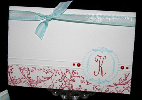
Here’s a close up.
I’m off to work today and I have prayer group tonight, but I hope to play some more challenges tomorrow. I hope you’ll come play and chat with the DD and DD Alums this week – it’s tons of FUN! If you’re not already a SCS Fan Club member this is the perfect week to join! Thanks for stoping by.
ETA: I just saw that Emily used one of my cards as the sample/inspiration for this week’s Color Challenge on SCS – this is the regular weekly challenge open to all. 🙂 It’s this card and the colors are River Rock, Soft Sky and Very Vanilla. You are welcome to play and even to combine challenges if you like! THANKS Emily!!!!