2008 Stampin’ Up! In Colors
July 11th, 2008
I just got my Demo Sneak Peek Pre-order and I had to stop everything and make myself a color chart for the brand new In Colors. Since I took the time to do it I thought I might as well take a few more minutes to share it here with y’all.
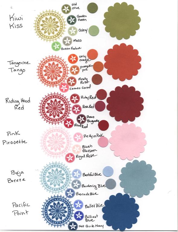 Click the thumbnail to see it much larger.
On the left are the ink colors stamped out onto Whisper White cardstock. Next to that are smaller images of other ink colors for comparison. On the right the large scallop circles are the cardstocks and just to the left of them are some of the other cardstocks punched out as smaller circles for comparison. Obviously scanning it only gives you an idea – but at least you can see some of the colors side by side if you don’t have them yet. On my screen the cardstock colors are reading a little darker than they are IRL.
My initial thoughts (knowing that new things usually have to grow on me):
Kiwi Kiss – Kind of a lighter version of Olive – prettier than I expected from photos I had seen.
Tangerine Tango – I’m not an orange person at all, but this is a nice color with a feeling of depth to it. The ink is pretty similar to Pumpkin Pie, but there is more of a difference in the cardstock.
Riding Hood Red – I definitley AM a red person and have been looking forward to this color. I’m very surprised at how similar it is to Ruby Red (especially the ink – more of a difference with the cardstock). To me it seems just a tad less orange though and so I do like it better. I see it as a *barn red* which is the color I’ve been wanting to paint my kitchen.
Pink Piroutte – a true soft baby pink – more different from Pretty in Pink than I thought from previous photos. The ink seems really light, but the cardstock is grogeous and will be one of my new faves I think.
Baja Breeze – I’m also not a blue person. This is a grayish blue – closest to Bordering Blue, but more blue and less gray. I’m sure I’ll like it more when I see some beautiful cards made with it, but for now it’s my least favorite.
Pacific Point – I’m actually surprised how much I like this color. It’s very vivid, but not obnoxious like Brilliant Blue. It has a richness to it. It seems closest to Not Quite Navy which is one of my favorite blues.
So tell me – which of the new colors is you favorite? I’m really going to miss Purely Pomegranate and River Rock, but I guess I need to start playing with Kiwi Kiss, Riding Hood Red and Pink Pirouette and see where they take me.
If you’re having trouble deciding which new In Colors to get or if you have limited funds and need to be selective here’s what I would recommend – buy a sampler pack or two of the cardstock to start and buy the ink pads in Kiwi Kiss and Pacific Point (if you like blue then add in Baja Breeze). For the other three colors you could start off trying to use the inks in Pumpkin Pie, Ruby Red and Pretty in Pink and see if you are happy with them being *close enough* or not. I’d love to hear what you think.
I’m off to finish getting ready for my class tonight. I kind of threw myself off schedule…time to play catch up. Thanks for stopping by!

P.S. be sure to check out Mary Jo’s blog (linked in my last post – she’s one of the Cupcake Crew) for some awesome ideas on using the brand new SU scallop edge punch!


July 11th, 2008 at 4:46 pm
Jami –
Thanks so much for posting the color chart! The information is so helpful! I know the new pink will be my favorite; but I liked some of the others better from your color chart than I thought I would!!!!
July 11th, 2008 at 5:04 pm
Hey Jami,
I love barn red too…so the Red Riding Hood is probably my fave.
BTW, I painted my kitchen (white cabinets) barn red 5 years ago and I STILL love it. Haven’t regretted it a bit.
Leeann
July 11th, 2008 at 10:41 pm
Jami,
Thanks for sharing. I’ll be getting my pre-order next week. I love your color chart, I’ll think I’ll put one together so I can see the comparison too. You have such great ideas!
July 12th, 2008 at 3:03 am
Jami, I love that you took the time to make a chart of the colors and wrote a comparison to the established colors. Thank you so much. I have ordered all the inks, reinkers and cardstock but they are still on the truck. I think I am most excited to see the Kiwi ink and cardstock. Olive and celery are my go to colors 99% of the time. Celery lacks a depth that I ususally am aiming for and the Kiwi looks like it might be right up my ally. Can’t wait to see. I actually like all the colors from one what I can see in your chart. It looks like the pink may be a far more pleasing color than Pretty in Pink. I sure hope so!
July 12th, 2008 at 7:55 am
Jami…you are awesome!!
Thank you for doing this chart. Now I can ‘wrap my head’ around the new colours.
I like the Kiwi Kiss and the Red Riding Hood Red (not really a red person) and the pink looks like a good pink – not a pink person neither – hmmmm – what’s happening here?
Thank you very much for the suggestions of ‘first’ buys.
You deserve BIG hugs Girl.
July 12th, 2008 at 8:39 am
Well, so much for “resistance” on my part. Thanks for furthering my tempting addiction to paper and ink. I love them all… I think…. but I’ll try to convince myself that I don’t. Love that Riding Hood Red and Pacific Point the most I think (for now). Thanks for sharing!
July 12th, 2008 at 10:23 am
Thanks so much for posting this-very helpful!
Bev J. (Maxell on SCS)
July 12th, 2008 at 4:07 pm
Hey Jami, forgot to mention this today at the Stamp convention, I looked at this the other day and LOVED it. Now I have to stamp one for myself for reference. GREAT IDEA!! Nice running into you girls today. Off for a birthday adult beverage!!