TECC25 Friendships
July 18th, 2008
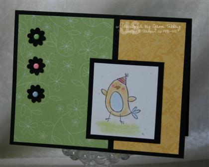
Happy Friday. It’s time for another one of Taylor’s fantastic sketches! Even though she’s off at CHA scouting out all the latest papercrafting products, she left us with a Friday Cupcake Challenge (cupcakes not required) to play. Get all the details on her blog by clicking here.
For this week’s sketch I decided to make a sentiment my focal image. I’ve had this Inkadinkado sentiment for quite some time and honestly I’m not sure if it had ever been inked. I love this sentiment as my friendships mean so much to me. Not having any siblings or even any cousins really having wonderful girlfriends has meant the world to me.
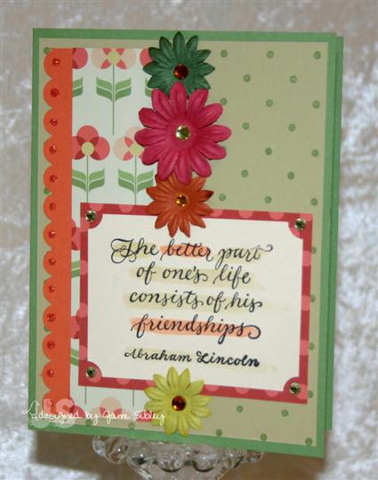
The sentiment was stamped on Poison Ivory shimmer cardstock with Palette Hybrid Noir Black ink and then highlighted with an aquapainter and ink in River Rock and Groovy Guava. Other cardstock used – Wild Wasabi base, River Rock layer with Polka Dot background stamped in Wasabi, Prism cardstock in orange (not sure exactly which orange) and SEI Winnie’s Walls dp. The prima flowers were embellished with Karen Foster adhesive rhinestones and the scalloped edge was fancied up with some Fruit Punch Stickles.
And now to check out the rest of the Cupcake Crew:
Lynn Mercurio: Stamperosity
Ana Wohlfahrt: Ink A Stamp
Stephanie Hargis: Steph’s Stampin’ Stuff
Vicki Chrisman: This Art that makes me Happy
Mary Jo Albright: Beauty Lies Within
Sherrie Siemens: Card Creme
Monika Davis: M.A.D. Stamper
PARTY ALERT!!!! In case you haven’t heard, next week is Dare to Get Dirty ’08 at SplitCoastStampers. Starting on Monday the 21st and running for 7 days you can play in challenges hosted by Dirty Dozen Designers (Current and Alumni) as well as chat with them in chat threads IF you are a member of the SCS Fan Club. Challenges will be posted at approximately 9am Pacific each morning – but you don’t have to play that day. I believe you’ll have 2 or 3 weeks to upload your creations. If you frequent SCS you really need to join the Fan Club – it’s kind of like supporting PBS. As a thank you for your support you will receive the opportunity to view all months of the exclusive Dirty Dozen Fan Club gallery, you get to participate in special events such as DTGD, and you have instant uploads for your gallery. So come join the fun and stamp with us next week!

Staying Home
July 17th, 2008
It’s been another busy week and Curt has been out of town yet again. He comes home tonight and I’m hoping he’s done traveling for awhile. I’m really glad he’s coming home as I’m feeling just a bit pouty about not going to CHA in Chicago even though it was really all my decision. It seemed like absolutely everyone was flying out yesterday and I was very much regretting my decision to stay behind. One of my sweet friends convinced me to just check airfares. I figured it couldn’t hurt – they would be astromically high and that would be that. But nooooooooooooooooooooooo….I actually found a very reasonable airfare at a good time. Well that sent me into a tailspin of trying to evaluate if I could actually manage to leave in less than 24 hours. I spent almost half the day agonizing and weighing out all the factors that I could think of. I’ve never been one to fly by the seat of my pants or do much of anything spontaneously, so I was quite proud of myself for even considering such a thing, but in the end here I am at home. And it’s really ok…I think.
Before I head out for work this morning I wanted to take a minute to share another Anna Wight Whipper Snapper card that I actually made last week using Blossoms and Butterflies and Blooming Expressions.
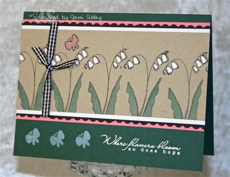
As soon as I saw this particular flower image I wanted to stamp it in a row for some reason. Don’t ask me where I came up with this crazy color combo – I honestly have no idea. I cannot remember the last time I used Handsome Hunter, but I wanted to use a different green that what I gravitate toward all the time. The flowers are stamped on Kraft cardstock and the blossoms are colored with a white gel pen. The sentiment is embossed with white craft ink and white ep (*Where flowers bloom so does hope*). Cardstock colors are: Handsome Hunter, Regal Rose, Black, White, Kraft. This card is very different for me, which is fun. These two stamp sets have inspired me to just PLAY which I need to do a lot more often.
I need to get to work now. Thanks for stopping by. Be sure to come back tomorrow for Taylor’s Cupcake Friday Sketch Challenge.
Whipper Snapper Bloomin’ Good News!
July 14th, 2008
Happy Monday! So are you ready for my big announcement? I sure hope so because I’m more than ready to share! I’ve been invited to be a Whipper Snapper Featured Designer for Anna Wight’s (a.k.a. SweetMissDaisy) July and August stamp set releases! How cool is that?
I’ve been a huge fan of Anna’s from the first time I saw her creations in the SCS gallery. I was lucky enough to get to work with her in the SCS Dirty Dozen AND I even got to meet her at CHA in January. She really is a doll! I’ve always loved the images she has created for Whipper Snapper (her birds, dogs and chickens have especially been favorites) so when she announced that she would be creating sets (as opposed to just single images) I knew they would be adorable. Imagine my excitement when I got the e-mail asking me to be on the rotating team for the Summer – WooHoo!!!! 
Anna is releasing FOUR new sets today – click here to see details on her blog! I have two cards to show you utilizing two of those sets – Blossoms & Butterflies and Blooming Expressions.

For my first card I inked up the flower with my SU markers and stamped on white cardstock. I highlighted the bloom with a Spica Glitter Pen and then I colored around the entire flower with a yellow copic marker softened with the colorless blender. The safron panel was first stamped with a small single blossom from the set and then run through my Cuttlebug. The little flower in the lower left corner is a Prima Hydrangea that I trimmed down with scissors to be a better scale for my card. The flag/banner for the sentiment was inspired by cards created by Anna as well as the amazing JulieHRR.
card deets:
cardstock: Regal Rose, So Saffron, white, Prisma Razzleberry Dark
ink: Old Olive, markers in Old Olive and Rose Red, Spica Glitter Pen, Copic Marker
other: SU ribbon – Regal Rose grosgrain and stitched pomegranate, Prima hydrangea, Adorn it yellow jewel droplet, plum Taylor Tots, Marvy punches, Cuttlebug
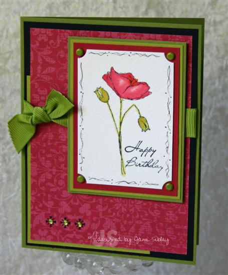
For my second card I stamped the poppy in Basic Gray ink on watercolor paper and colored it using an aquapainter with ink from the SU pads squished onto a cd. I used the new colors Pink Pirouette, Riding Hood Red and Kiwi Kiss along with Old Olive knowing that I wanted to use some of this yummy new SU Bella Rosa dp. I was going for a rich and elegant look this time. The sentiment is actually all on one line, so I just inked one word at a time and used a Stamp-a-majig for placement. (I guess I could have cut the words apart, but I thought of that later *eye roll*) I love that Anna included basic sentiments like Happy Birthday and Thank you in this wonderful set. Plus she has used really beautiful fonts! (Do you love fonts as much as I do?) I doodled around the edge of the image panel and clipped the corners with a ticket corner punch before triple layering onto Riding Hood Red, Kiwi Kiss and Old Olive cardstock. The element in the lower left corner is a rub-on from SU’s Eastern Elegance adorned with Karen Foster adhesive rhinestones in light green.
card deets:
cardstock: Old Olive, Black, Kiwi Kiss, Riding Hood Red, Bella Rosa dp, watercolor paper
ink: SU Basic Gray, Palette Hybrid Noir Black
other: Old Olive grosgrain, Old Olive brads, ticket corner punch, Eastern Elegance rub ons, Karen Foster rhinestones, foam tape, aquapainter
As if being on the team wasn’t exciting enough, I just about came unglued when I saw who was going to be on the team with me. I admire every single one of these ladies and couldn’t be happier to work side by side with them (just hoping I can keep up! LOL!). I’m off to see what each of them has created…wanna come along with me? This is going to be some fun blog hopping for sure!

Carol Halvorson
Happiness Blooms
Leslie Miller
Running with Scissors
Pam Hooten
Iris Garden
Trudee Sauer
Follow Your Bliss
In all the excitement I almost forgot to mention…at the Carson Rubber Stamp Convention on Saturday, besides almost having dinner with Tim Holtz (oops – did I drop a name?), I won a drawing for $10 worth of free product at Auntie Amy’s booth. We had just walked up to look at the booth and they asked if we wanted to enter because they were about to draw. Well of course we wanted to enter! About 2 minutes later the lady was shouting my name! Very cool! I got some Crafty Secrets Cotton Scraps (been wanting some for a long time) and some Kaiser Craft pearls in bright red. FUN! Now if I could just win that Spellbinders drawing – I actually managed to enter all 14 days so I have my finger crossed! Looks like this could be my lucky week!
Thanks for stopping by. If you have a minute please leave a comment to let me know what you think of all of Anna’s new sets.
July Stampin’ Up! Class
July 12th, 2008
Last night was my monthly SU Class. My hostess club wrapped up last month and starts up again next month – originally I was going to take this month off, but I just couldn’t do it. LOL! Since it wasn’t part of club I decided to skip the techniques and just do some easy, fun stamping!
My first project was very closely CASEd from a card I got at SCSM in April, but darn it I’ve misplaced the original and don’t know who the creator was to credit. I’ll try to look for it this weekend and edit my post if I find it. If youknow who made it feel free to let me know! (ETA: The card was made by Ginny – ginkap on SCS. Ginny thanks so much for commenting to let me know! I loved your original!) As soon as I saw it I knew it would be perfect for a class. The original used Fun & Fast Notes which I really like but do not have, so I subbed Pun Fun and let everyone choose whichever image they wanted from the set.
The main image was stamped onconfetti white cardstock and colored with SU pastels simply using q-tips. The card base is black so there is a confetti white panel inside with the matching sentiment stamped in the lower right hand corner. Easy peasy, but oh so cute.
Our second project used the scallop notes cards and vanilla envies in Soft Sky layered with Always Artichoke.
Sweet Shapes is on the retirement list and it seemed just perfect for these little notecards. Ink in Soft Sky, Taken With Teal and Artichoke along with some sponging and Dazzling Diamonds glitter made this a quick and fun project. We even decorated the envelopes.
And the third project was my favorite! Remember that I told you I was saving those cute little notebooks from Big Lots for a class? Well – here they are!
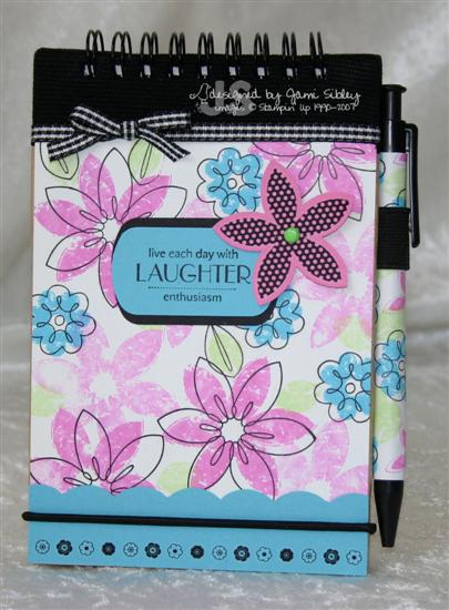
I haven’t used Bold Brights much in awhile, but this combo of Pixie Pink, Tempting Turquoise and Gable Green with just a touch of black is so happy – how can you not smile? I’ve always loved Bud Basics because it’s so versatile so I am sad to see it retire. I was very glad to get one more chance to use it on a class project. I paired it with a new favorite set Sweet Serendipity and let everyone choose whichever sentiment they prefered. I love the way they all fit in the key tag punch. We simply punched two black key tags to layer behind the turquoise sentiment. I stil had rub ons from teh Demo bulk buy pack and they were perfect for the bottom edge as well as for the punched Pixie flower. The scallop edge at the bottom was made with a corner rounder – I had the project all prepped before I realized my new scallop punch would be here today!
I like this notebook so much I might need to make some matching cards or a gift bag or something!
I’m off this afternoon to the Carson Rubber Stamp Convention. I’ve been going to this show for years. It’s gotten really small compared to what it used to be, but it’s become more about hanging out with friend than shopping so I always enjoy it no matter which vendors show up. Hope you have a fabulous weekend. Please please come back on Monday – I’ve got something GOOD for Monday!! Thanks for stopping by.
2008 Stampin’ Up! In Colors
July 11th, 2008
I just got my Demo Sneak Peek Pre-order and I had to stop everything and make myself a color chart for the brand new In Colors. Since I took the time to do it I thought I might as well take a few more minutes to share it here with y’all.
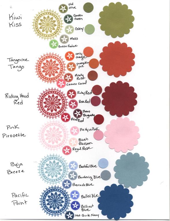 Click the thumbnail to see it much larger.
On the left are the ink colors stamped out onto Whisper White cardstock. Next to that are smaller images of other ink colors for comparison. On the right the large scallop circles are the cardstocks and just to the left of them are some of the other cardstocks punched out as smaller circles for comparison. Obviously scanning it only gives you an idea – but at least you can see some of the colors side by side if you don’t have them yet. On my screen the cardstock colors are reading a little darker than they are IRL.
My initial thoughts (knowing that new things usually have to grow on me):
Kiwi Kiss – Kind of a lighter version of Olive – prettier than I expected from photos I had seen.
Tangerine Tango – I’m not an orange person at all, but this is a nice color with a feeling of depth to it. The ink is pretty similar to Pumpkin Pie, but there is more of a difference in the cardstock.
Riding Hood Red – I definitley AM a red person and have been looking forward to this color. I’m very surprised at how similar it is to Ruby Red (especially the ink – more of a difference with the cardstock). To me it seems just a tad less orange though and so I do like it better. I see it as a *barn red* which is the color I’ve been wanting to paint my kitchen.
Pink Piroutte – a true soft baby pink – more different from Pretty in Pink than I thought from previous photos. The ink seems really light, but the cardstock is grogeous and will be one of my new faves I think.
Baja Breeze – I’m also not a blue person. This is a grayish blue – closest to Bordering Blue, but more blue and less gray. I’m sure I’ll like it more when I see some beautiful cards made with it, but for now it’s my least favorite.
Pacific Point – I’m actually surprised how much I like this color. It’s very vivid, but not obnoxious like Brilliant Blue. It has a richness to it. It seems closest to Not Quite Navy which is one of my favorite blues.
So tell me – which of the new colors is you favorite? I’m really going to miss Purely Pomegranate and River Rock, but I guess I need to start playing with Kiwi Kiss, Riding Hood Red and Pink Pirouette and see where they take me.
If you’re having trouble deciding which new In Colors to get or if you have limited funds and need to be selective here’s what I would recommend – buy a sampler pack or two of the cardstock to start and buy the ink pads in Kiwi Kiss and Pacific Point (if you like blue then add in Baja Breeze). For the other three colors you could start off trying to use the inks in Pumpkin Pie, Ruby Red and Pretty in Pink and see if you are happy with them being *close enough* or not. I’d love to hear what you think.
I’m off to finish getting ready for my class tonight. I kind of threw myself off schedule…time to play catch up. Thanks for stopping by!
P.S. be sure to check out Mary Jo’s blog (linked in my last post – she’s one of the Cupcake Crew) for some awesome ideas on using the brand new SU scallop edge punch!
TECC24 I actually used a CUPCAKE!
July 11th, 2008
WooHoo it’s Friday! My Stampin’ Up! class is tonight, I’m feeling much better, Curt got home last night from a business trip and it’s time for Taylor’s Cupcake Challenge – an all around good day!

I was so excited when I saw Taylor’s sketch this week because I already had this cute little Lockhart Rosebud Cupcake colored, punched and mounted just waiting to be made into a card. There were so many possibilities for the large panel, but I knew I wanted to feature a sentiment, so I looked through my sentiments drawer until I came across the perfect one from SU All Holidays. Then I decided it would be fun to have a floral background to go with the tiny rosebud frosting. Retired SU Mixed Bouquet seemed perfect and I still really love that set. Once the panel was stamped it seemed a bit too bold though and overwhelmed my tiny cupcake. A vellum overlay was an easy fix for that and a great way to showcase the sentiment. Adhering vellum can be a little tricky. In this case I used green rhinestone brads on the left side and some Scotch Tacky adhesive on the right under the ribbon and cupcake. The little finishing details: swiss dots Cuttlebug folder on the Regal Rose panel, pink stickles (they are really almost burgundy) around the scallop circle, Kaiser Craft rhinestones on the olive grosgrain ribbon. Cardstock: So Saffron, Regal Rose, Prisma Razzleberry Dark (close to Purely Pomegranate), white, vellum.
We’d love to have you play along with Taylor’s Cupcake Challenge – it’s a simple sketch challenge, cupcakes NOT required. Check out her blog here to get all the details. You could be chosen as Taylor’s featured stamper like Terri Dodd (SCS = tdodd00) this week. Check out her gallery here – and her blog here – lots of great stuff including last week’s winning challenge card. I can hardly wait to see what she’s done this week!
Let’s see what the rest of the Cupcake Crew came up with:
Lynn Mercurio: Stamperosity
Ana Wohlfahrt: Ink A Stamp
Stephanie Hargis: Steph’s Stampin’ Stuff
Vicki Chrisman: This Art that makes me Happy
Mary Jo Albright: Beauty Lies Within
Monika Davis: M.A.D. Stamper
Oh and don’t forget the Summer Sale at Taylored Expressions – details on Taylor’s blog. It only lasts through the weekend, so check it out quick!
Thank you to everyone who e-mailed to see if I’m feeling better. Yes I definitley am – just been trying to catch up with things this week. I really apologize for missing Divine Design on the 8th. I plan to catch up on that sometime next week. Also early next week I’ll have an exciting announcement – I can hardly wait! Over the weekend I plan to post my projects from tonight’s class so be sure to check back. They’ll be strictly Stampin’ Up!
Thanks so much for stopping by. Have a fantastic weekend!
PS to SU Demos – I have a Sneak Peek swap posted on SCS with just a few spots left. If you’d like to play and can deliver on-time quality swaps, please click here for the details. Thanks for looking.
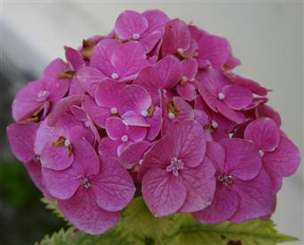
Hydrangeas
July 6th, 2008
Being sick and lying on the couch for a few days has gotten me a little behind on things, but yesterday I finally felt like stamping a bit and what better way to ease my way back in than using some already-colored images. My uncle had a surgical procedure a little over a week ago and along with magazines and snacks for the waiting room, I packed up all my Copic markers and a variety of stamped images. I only ended up coloring a few that day, but the one I was most anxious to make into a card was the Hydrangea image by Lockhart – my first time using it.
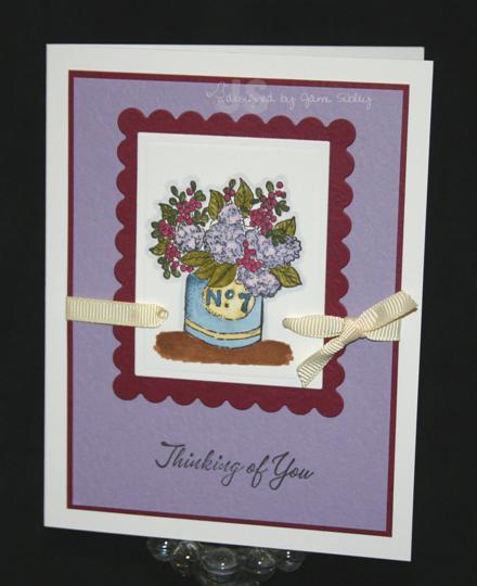
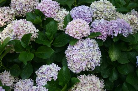
Hydrangeas are my second favorite flower – right after roses – and I had been wanting this mage for quite awhile thanks to my friend Sharon and her gorgeous creations with it. We have two hydrangea bushes. The one in the backyard is HUGE and the flowers range from pale lavendar to dark purple.
This is what I had in mind as I colored this image. When I sat down yesterday to make a card with it, I pulled out my Prismatics color swatch book to find some pretty coordinating cardstocks and came up with Majestic Purple Light and Razzleberry Dark (similar to pomegranate or cranberry – not as brown as it looks in the photo). I used my rectangle nestabilities to cut and emboss the image as well as to mat it. I decided to use a white card base (Paper Trey) with a fairly wide border for high contrast. The sentiment is SU Warmest Regards and the ribbon is SU cream grosgrain.
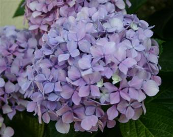
Our second hydrangea bush is in the side yard and it’s a scrawny little bush that didn’t look like it was going to make it for a couple of years there, but it has the most beautiful bright pink/almost red blooms! I realize there is stuff you can add to the soil to change/influence the color of the blooms…but do they have a natural color different for each plant or is all determined by soil? These two plants are only about 25 feet from each other.
I’m not a gardener by any stretch of the imagination. I love love love a beautiful garden and I really did try for a few years to love gardening, but I just couldn’t do it. I hate to get dirty (even as a small child I never liked dirt or mud on my hands), I don’t really like to be outdoors very much, I have a bad knee that won’t tolerate a lot of squatting and kneeling, and ok let’s face it…I’m just too much of a *princess*! bwahahahhhahahaha!
 But if I could have a beautiful English garden with a picket fence and tons of roses and hydrangeas and foxglove and a wicker chaise – all requiring no maintenence – I’m there!
Thanks for stopping by and happy Monday!